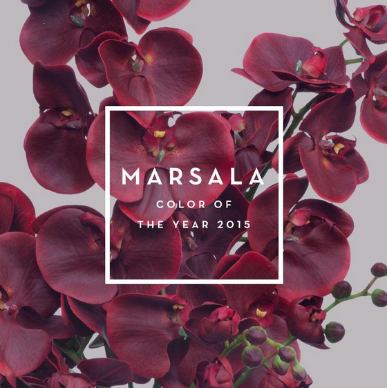
It seems a bit surprising with the move towards contemporary design that a red-wine hue would be the color of the year. Pantone declared that tone, Marsala, the omniscient color for all design for 2015. However, it can work well with contemporary design. When designing or creatively changing areas of your home, consider these four tips to staying up to date with The Color of the Year.
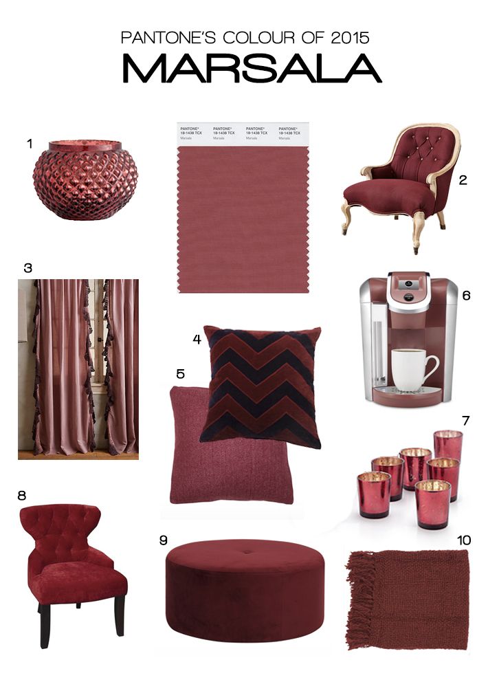
1. Keep it Minimal: When painting, designing, accenting, etc, with the color Marsala, keep it minimal. For example, use the color in accessories, accent walls or upholstered furnishings, and perhaps an accent piece of furniture.
2. Sophisticated, yet Signifies Earthiness: The deep red-wine hues of Marsala reflect the same characteristics of a Marsala wine. The color signifies sophistication, just as it was used in the baroque period. However, the deep tones also signify earthiness.
3. Pairs Well with Neutrals: The deep sophisticated tones pair perfectly with grey earth tones as well as metallic shades. Deep greys and Marsala create a well-balanced decorative pallate. Metallic shades (whether gold, rose gold, or silver) and Marsala pair for a perfect textured accent piece of décor.
4. Transports Baroque to a Modern Edge: Historically, such deep tones have consistently been used lavishly to decorate elegantly. Bringing accent pieces with such elegance to a modern room, creates drama with a modern edge.
Photos courtsey of Pantone.
As always, when you think home, think La Maison.
La Maison Interiors, www.lamaisonaz.com, 480.948.1144