
By Tanya Shively, ASID, LEED AP (with David M. Brown)

White-outs are out, colors are in.
My interior design clients want blues and greens and golds. They want palettes from earthy yet colorful to bold yet playful.
If you desire a very light and bright color scheme, icy blues and pale greens mixed with light grey are in the spirit of “Hygge,” a Scandinavian style that emphasizes coziness and snuggle.
White, for a number of years the go-to color (actually, white is the absence of color), is fading; grey, too. They’re considered unexpressive and subdued in a let’s-connect world full of pop, splash and pizazz.

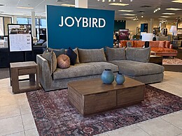
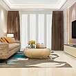
For their homes, condos and apartments, my clients crave soft contrasts: warm rose, earthy pinks, and mauve paired with beige and warmer neutrals. Or splashes: a kitchen with bold blue on the range and the island cabinets. Or pops: on pillows, poofs, cushions and other smaller pieces.
They’re embracing warmer colors, with neutrals on the walls and flooring and color in the furnishings and bedding.
I connect this shift with the spirit of our times. The white and grey trend was a reaction to the emotional climate of the last decade, with people pulling back and being more conservative. With the economy as strong as it’s ever been, and unemployment historically low, people are positive and want to reflect that in their living spaces. Thus, the colorful, cheerful palettes we’re seeing more often.
With a paintbrush and roller, you can make a color change quickly; if you don’t like it, it’s gone and replaced. Artwork always adds personality and is a great way to bring in pops of color. Accessories, decorative pieces and rugs can also add color without having to remake a space or an entire home.
Darker walls allow art to stand out more dramatically than white walls will. Photo Jerry Portillo
Plants are always a nice touch. They bring life into a room, literally and figuratively. They’re not always just green. Try bright pink and red or gold leaves, for instance.
I always consult with a specialist such as Joe Zazzera, founding principal of Plant Solutions in Scottsdale, for suggestions on live and faux plants. He recommends living examples that are appropriate for the lighting and humidity conditions of the space. His company also does plant walls, which are living sculptures that also help clean the inside air. They’re great outside, too.

“Interior plants, such as bromeliads and antheriums, create strategic pops of color and enhance any design strategy,” says Zazzera, who is a certified biomimicry professional. “Current interior plant design trends are having a huge impact on the frequency of using living plants and pops of color in residential and commercial interior environments. Human wellness finally has a place in interior design strategies. Living plants help fulfill that strategy.”
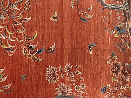
Rugs also bring the character, warmth and texture of hand-woven art to your floors or as wall hangings. Vendors such as AZADI Fine Rugs and David E. Adler Fine Rugs, both in Scottsdale, have high-quality examples from around the world.

“The rug is typically the largest object in a room. It can dominate the room and be the centerpiece or it can subtly subordinate to other design elements of color, fabric, upholstery or artwork,” says Adler, who’s had a Scottsdale showroom for 47 years, offering a wide variety of designs and styles, from modern to antique, sophisticated to tribal.
“In recent years, the trend was quiet, tone-on-tone rugs, commonly in shades of ivory, as these were easy to design around,” he says. “Recently, more robust, jewel-toned rugs have become more widely popular. Additionally, many people like to design their own bespoke carpet, expressing their own artistry.”

Paint makes an immediate change, whether it’s just on one wall or all and the ceiling. A few pointers, though.
A brightly colored wall will draw your attention and give the impression it is larger than it actually is. A strong, warm color on an end wall will shorten the apparent length of a room by drawing that wall forward. And, cool or dark colors will make the wall appear to recede, expanding our perception of the room.
Remember, too, that dark ceilings lower the apparent height of a room and light ceilings raise it. Spaces may be made to appear larger than they are by unifying them with color and light, which melds surfaces rather than fragments them.
Ceilings that are the same color as walls will create a clean, contemporary look. But because of the way light affects color, the ceiling paint will need to be approximately 50 percent lighter than the walls to create the illusion that the surfaces match.
My favorite color? Red. It’s bold and vibrant, attention grabbing and energizing. It’s a great accent with almost any other color. For neutrals, I gravitate to warmer colors. Even if my primary is grey, I like secondaries that are warmer rather than cooler.
When I work with clients, one of the first questions I ask is what their favorite colors are as well as which colors they dislike. Their answers tell me a lot about their personalities and what they will like for their overall décor, beyond what the color scheme will be. That puts me on a path to their happiness.
 Shively is principal of Scottsdale’s Sesshu Design Associates, honoring the 15th-century Japanese artist, Sesshū Tōyō. An interior designer for 20-plus years, she does large and small renovations as well as whole homes. She is a Valley pioneer in sustainable, or green, design. Reach her at 480.275.2968, tanya@sesshudesign.com, Facebook.com/sesshudesign, and through sesshudesign.com.